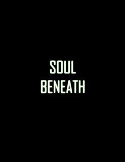
Here is the first idea that I had. I thought it was bold and simplistic like my film and also my production companies. Originally, I had the film title in a bigger font but my neighbouring peer, Bill, suggested using a smaller font. I preferred this look as it creates a lot of empty space around the title and because of the contrasting black and white (and the fact that the title is the only thing on the page) you are instinctively drawn to it. Myself and Bill also thought that only having the film title on the poster created intrigue and questions in the viewer that made them want to find out more about the film.
On the right is my second idea. I thought that because the title was going to be the only thing on the page, that it should be bold and interesting. So, I duplicated the white title and changed the colour to a light and strange shade of green. I then layered it over the top of the white title, slightly off centre, so that it creates an image that looks 3D.
Left is my third idea. This time, I simply changed the white text to black so that the green text appears as if it has breaks in it, almost reflecting the personality of my protagonist.
The fourth idea is on the right. This idea was thought of by Bill and I think that the use of a purpley-pink looks very effective.
Left is my fifth idea. For this idea, I used white text and added a green glow around it which illuminates the title and, I think, makes it stand out from the page even more. Also, the illumination could be a reference to the searchlights that the viewer sees in the film opening.


No comments:
Post a Comment